I recently discovered a random selection of the best pour-over coffee makers on Wirecutter, the NY Times’ wing c ever-green reviews and buying advice. I don’t need a coffee machine and I don’t even remember how I got to this page. I may have just been looking for something online. But no matter how I got there, I discovered one thing that threw me off balance.
And so, you discover a selection of the best products. It could be anything: the best smartphones. the best TVs under $1000 or the best mattresses. But I expect every recommendation to include a link to a product review so I can go deeper and see exactly how the media reviewed the product and why I’m being recommended. For example, what are the pros and cons and the experience of using it.
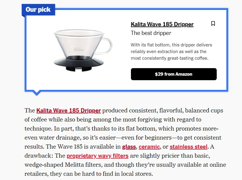
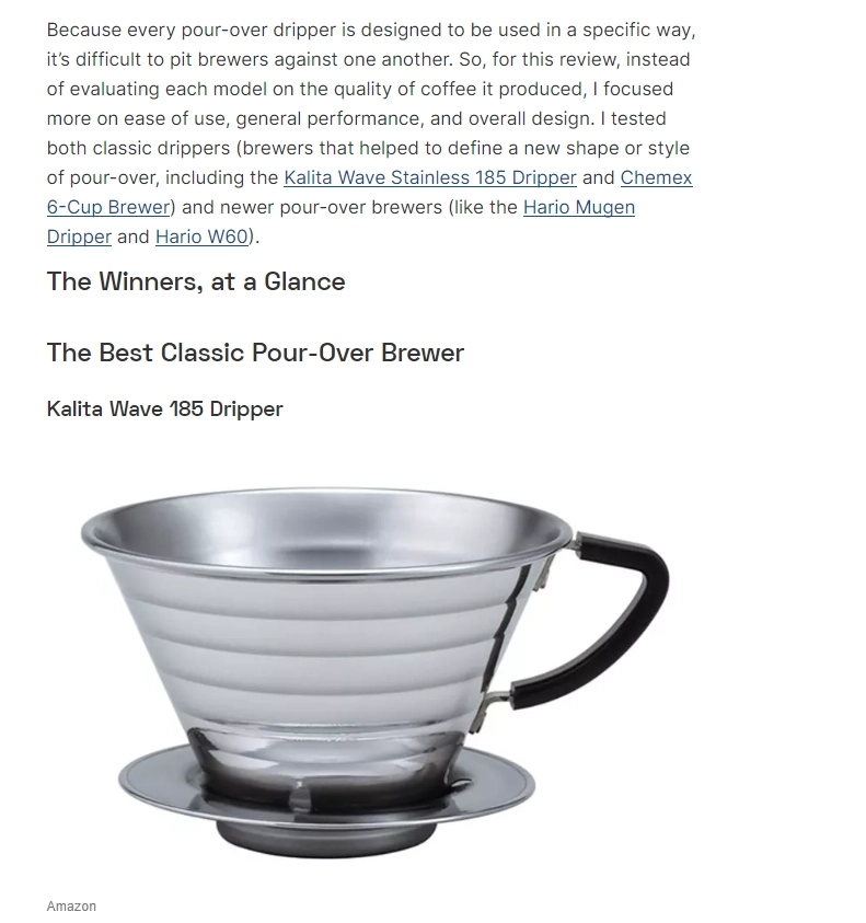
Now take a look at this screenshot:

Again, I don’t need a coffee maker; I was trolling the internet. But look at these links in red—especially the name of the coffee maker. I clicked on it almost automatically because I wanted to read a review. I remembered well the moment I hovered my mouse and looked at the bottom left corner of the screen to see where the link would take me. At the bottom, it says nytimes.com/wirecutter.
So I clicked on it. But clicking it didn’t take me to a review that would have given me more information about the product. I got to the purchase page on Amazon. Of course, it’s an affiliate link, and Wirecutter will get a commission if I buy something through it. It’s identical to the big “from Amazon” button and will take me to the same page. As you realize, the address I see when I hover over the link is the redirect address to count my clicks for internal reporting.
It’s not just Wirecutter that does this, but other sites that publish “best products” lists. They have lots of links to the products they write about. But they don’t lead me to a review (in fact, none of the sites in the top 10 Google rendition offer me more detailed reviews), instead I’m launched to an affiliate link.
Here’s what it looks like on Serious Eats:

Of course, these links are affiliate links. So they will take you to Amazon. I did a little experiment, asking 45 people to guess where they would end up by clicking these links. It was an open-ended question so that people could answer anything.
Of course, these links are affiliate links. So they will take you to Amazon. I did a little experiment, asking a few people to guess where they would go when clicking a link. Of 17 people, 11 thought it would be a product review, not a link to buy.
CNN also uses affiliate links in articles in its Underscored arm and dozens of other sites. And I might argue: nowadays, they all have a disclaimer that says “when you buy products through our links, we get a commission”. Ah-ta-ta-ta, it’s all fair game, we’ve warned you.
But I don’t have so much a complaint about the affiliate links (they’ve become so commonplace that now all the “best products” lists are click farming) as I do about the fact that they appear not only in the “buy” button but in the text itself. A good rule of thumb of the internet is that clicking on links in an article usually takes me to something that will give me more information, rather than a purchase page. That’s because the links are embedded in the products, in words like “cup”, “spoon” and “ceramic”, not in a phrase a la, “we can buy this here”.
This is a small but important trick that allows publishers to embed many links that often lead to the same product.
The solution is here, but the media won’t like it
For a long time in Germany, major media outlets have put a special sign next to affiliate links indicating that clicking on it will lead you to a purchase. This makes the whole process more transparent because by using such a sign, the reader knows that a buy button or a link will take him to another site to buy.
Here’s how it looks on Chip.de; I translated it from German to English using Google Translate:

Of course, this approach will piss off publishers who make lots and lots of money by posting affiliate links. But it will also change how people look at articles and their level of trust in what they see because it’s more transparent and straightforward to any reader.
And if we’re driven to be “reader first,” that’s an honest approach. And its time has come.


