
Quite a few people in the world use Microsoft Excel because it’s a handy tool for many activities. Using Microsoft Excel you can improve and optimize your work in many activities. People with the help of Microsoft Excel do a lot of projects for studies, together with teamwork in famous companies. The most important advantage that creates the functionality of Microsoft Excel is the formulas. With the help of formulas, people have ready data to work with in the future.
One of the most common ways to demonstrate important information in the form of charts in Microsoft Excel. This can structure your data into different types of charts, creating what is most readable. However, many people don’t know how to do this, you can figure out how to build a bubble chart in Microsoft Excel.
What is Microsoft Excel
Microsoft Excel is a program that includes many features to make life easier for many people in mathematical calculations. In addition, Microsoft Excel creates many opportunities to structure all the information in order to work as efficiently as possible, such as creating a bookmark in Excel.
Microsoft Excel is primarily a spreadsheet program that allows you to store, organize, and analyze information. The main areas of work can be home budgeting, making both simple and very complex calculations, storing data, organizing various diaries, making reports, making graphs, charts, and much, much more.
Microsoft Excel has many advantages, but the most important one is, of course, its versatility. There are many things you can do with Excel, and it’s hard to imagine what you can’t do with it. In addition to Microsoft Excel, there are a number of similar programs that also use spreadsheets at their core, but Excel is by far the most popular.
Read also:
- How to freeze rows and columns in Excel
- How to refresh a pivot table in Microsoft Excel
- How to insert check mark in Microsoft Excel
What is a bubble chart and what is it used for
Nowadays, Microsoft Excel skills aren’t considered an asset for a job search. It has long been a necessity, especially for office work. At the same time, there are many training courses that help people understand this, as well as many sites on the Internet offering tips and tricks for Microsoft Excel.
One of the functions that not everyone has worked with and knows how to interact with is the bubble chart. Bubble charts are a special type of chart in Microsoft Excel that is usually used to display multiple dimensions of data. Google Spreadsheets and Microsoft Excel have a special ‘Chart’ function that includes bubble charts. Creating a bubble chart in Google Tables isn’t difficult, but it can be difficult to properly format the data for it for the parameters you need. .
Microsoft Excel actually has many different functions that aren’t intuitive in order to get any results. That’s why Microsoft Excel isn’t a program that you can work with without any problems or particular skills, every time to get some result, you will need to find the answer on the Internet, if you are a beginner. It’s the same with combining two columns in Microsoft Excel, which is necessary to work with and not obvious.
What to do to build a bubble chart in Microsoft Excel
In fact, creating a bubble chart won’t be much of a problem. However, in return, you will get a great way to structure the information in Microsoft Excel and make your document richer. To build a bubble chart in Microsoft Excel follow these steps:
- The first step to build a bubble chart is to open Microsoft Excel.
- Then you need to open a blank worksheet.
- After that, in the cells specify the necessary information that you want to see in the bubble chart.
- Then you need to select the data you want to put in the bubble chart.
- After that click on ‘Insert’.
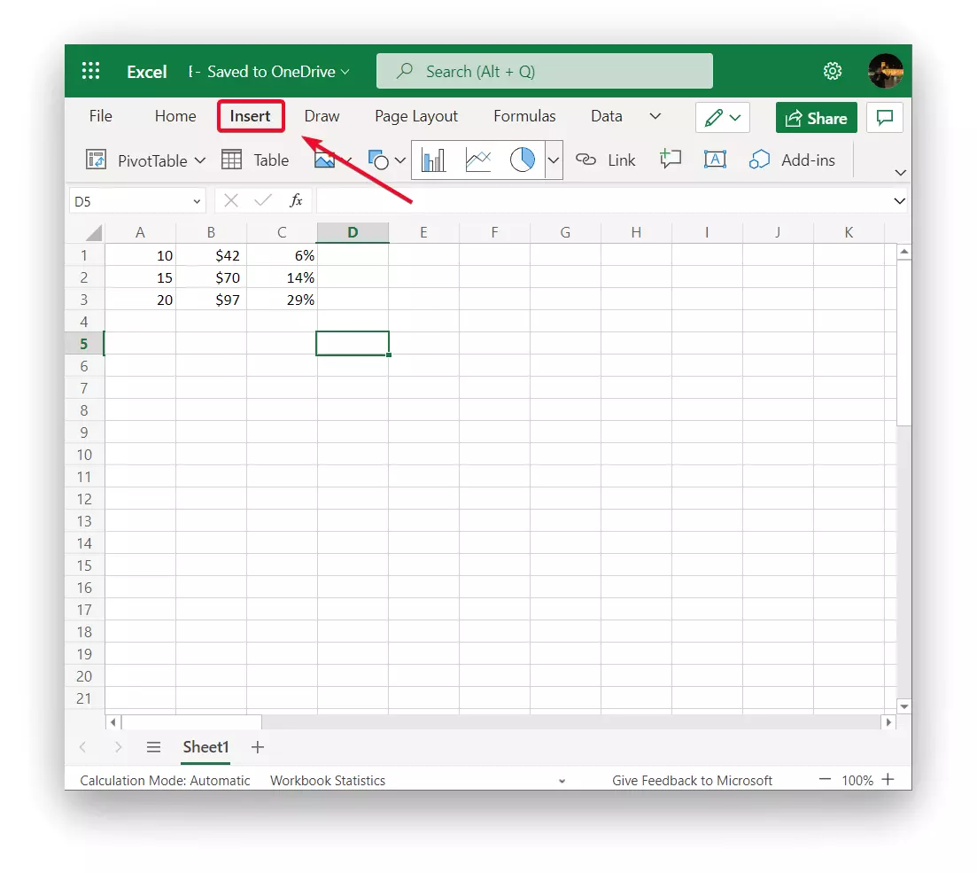
- Once a new taskbar opens click on the ‘Insert chart’ arrow to open up all the chart options.
- Scroll down and select the bubble chart under ‘Other‘.
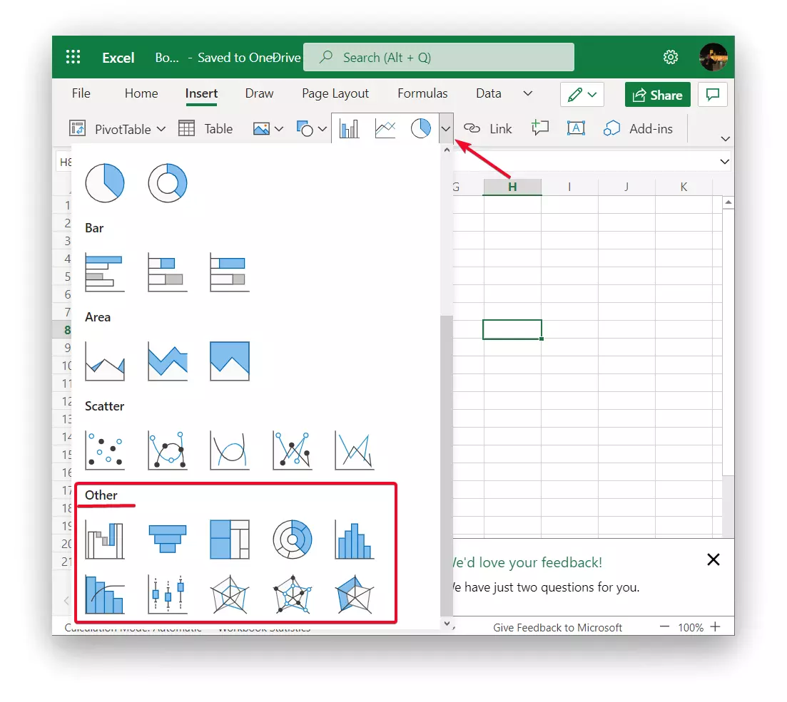
- Then on the ‘Format’ tab in the ‘Size’ group set the desired size of the chart in the ‘Chart height’ and ‘Chart width’ fields and then press the Enter key.
- Next, in the ‘Chart Elements’ section, specify all the parameters you need.
After these steps, a bubble chart will appear in your Microsoft Excel document. If you didn’t enter any data that made your chart unique you can save it as a template. To use as a basis for other similar charts in the future.
What to do to build an interactive bubble chart in Microsoft Excel
Actually, not many people use the ability to build an interactive bubble chart, because sometimes a standard bubble chart is enough. However, if you want to get a more accurate picture of what is going on, you have to figure out how to build an interactive bubble chart. To build a bubble chart, you need to follow these steps:
- The first step is to open the sheet and enter the necessary information.
- After that, in the ‘Insert’ section click on ‘Power View’.
- Then you need to enter the ‘Construct’ section from the top of the tool’s main menu, and then expand the ‘Other Diagram’ subsection by clicking on the arrow at the bottom.
- Then select from the list ‘Dot Chart’.
- If the dimensions or something else is displayed incorrectly, change the parameters on the right side of the window.
This method is a bit more complex than the previous one but it will give you a much better performance. You will create a much better representation by referring to the tabulated values.
Read also:
- What is today’s date formula in Excel and Google Sheets
- How to add colors to alternating rows in Excel
- How to use the SUBSTITUTE function in Microsoft Excel
What to do to build a bubble chart in Google Sheets
In addition to being able to create a bubble chart in Microsoft Excel, you can do it in Google Sheets. People choose this way more often because Google Sheets is easier to use. To build a bubble chart in Google Sheets follows these steps:
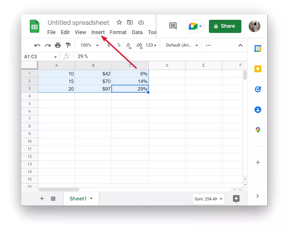
- First, you need to open Google Sheets and create a new sheet.
- After that, enter all the necessary information to create a bubble chart.
- Then select it and click on ‘Insert’.
- Next, you need to select ‘Chart’ from the list.
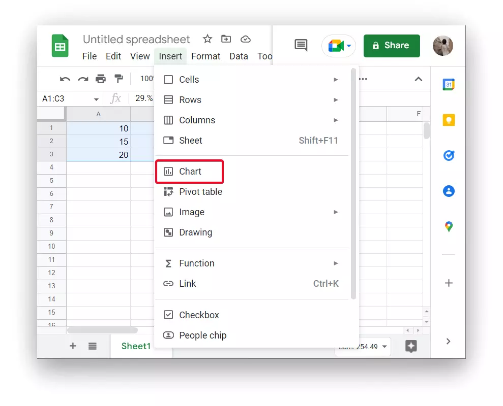
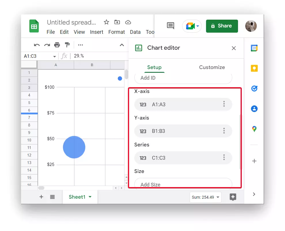
- Then click on ‘Setup’, then click on ‘Chart type’, and from the drop-down list select the second type of section ‘Scatter’.
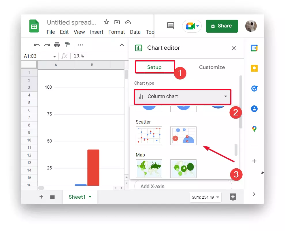
- After that, you will see a bubble chart, change the size and appearance if necessary.
After these steps, you will be able to structure your information and make it more readable. At the same time, create Master Sheets in Google Sheets so that the information can be synchronized in one sheet. Sometimes this is a necessity in order to set up synchronization and make your files as automated as possible. To do this, figure out what a Master Sheet in Google Sheets is and what formula you need for it.


